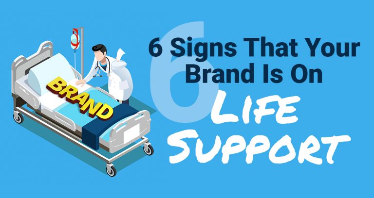
We’ve all been to websites that didn’t catch our attention. We’ve all been to websites that were full of text, no images, and no organization whatsoever. Even worse, we’ve all been to websites that didn’t have ANY contact information. I can go on and on here, but instead, I’ve put together a list of 6 dos and don’ts for your current or next website.
Here we go:
1. DO include contact information (always).
Your phone number, email address, and/or contact form should be clearly visible because if people don’t know how to contact you, you’ll loose business every time. People are generally lazy and don’t want to search for your contact info, unless they really want to do business with you.
2. DON’T have too much text. OMG!!
It’s so annoying to go to any webpage that has 80% text with very little images. Or worse, no images at all. Honestly, whenever that has happened to me, I’ve immediately exited the website. The human eye has been trained to see variations, and our minds have been trained to perceive larger text to be more important than smaller text. If all text on your website is the same size with no images, the visitor’s mind registers that nothing is important enough to highlight. Humans are visual beings– give people something to LOOK at and not just READ.
3. DO have strong call-to-actions.
A call-to-action (CTA) is something that you want your visitors to do. i.e. “Call”, “Email”, “Subscribe”, “Download”. One thing I would highly recommend is to create an email list and embed the subscribe form on your website. Send a regular newsletter to your subscribers. You may give them a discount or helpful resource in exchange for their email address. You can also send helpful tips and advice related to your business/industry. Having strong CTAs is all about being and staying connected with visitors, and converting them into customers.
4. DON’T put your social network icons at the top.
You may think this is counterintuitive, but hear me out. When a visitor lands on your homepage and one of the first things they see is your Facebook icon, they will click on it. And, when they do, they exit your website without getting the info they needed. And, we all know that once you’re on Facebook, you’re sucked into this black abyss never to return back to your previous task. To avoid this, put your social network icons at the bottom of the page. This gives visitors an opportunity to actually click around your site. Visitors come to your website for a reason- don’t give them a reason to leave too soon.
5. DO have a clear message.
There’s nothing worse than someone visiting your website and be confused about what it is you do. Spell it out (seriously). Leave no room for guessing or anonymity. Have catchy headlines and interesting website copy that engages and intrigues your visitors. The #1 goal is to convert those visitors into followers, subscribers, and CUSTOMERS. If you’re not clear on who you are and what service/product you offer, you’ll never reach that goal. BE CLEAR AND CONCISE.
6. DON’T ever use Flash.
Adobe Flash technology is outdated and is incompatible with many of today’s mobile devices. Yes it was cool back in the early 2000’s, and can even give a “pop” to your website, but 98% of your visitors will be inconvenienced by outdated browser javascript or incompatibility on mobile. A great alternative to Flash is JQuery.
I hope this was informative and enlightening! If you need help building a website or maintaining and updating your current one, let us assist. You’re a business owner- you don’t have time to worry about what you should and shouldn’t have on your website. Let us do the worrying for you! Contact us today and let us help you do what you do best… change the world!
Click here to tell us about your needs.


